What’s the secret to happy pattern play? Since becoming part of Parker and Jules I have been thinking about this ALOT, for those that don’t, a few ground rules to start us off maybe?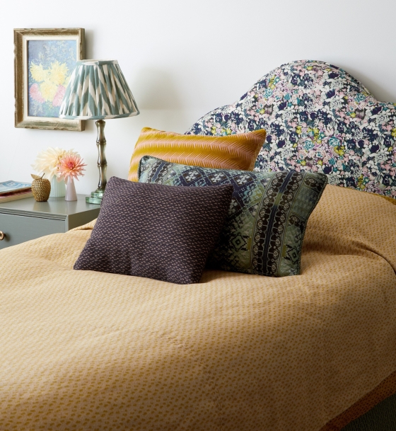 At P and J we worked across several colours all in the same tonal field, the varying scale and complexity of these patterns means they flow easily together.
 Then we have also done the classic, patterns grouped around a ‘standout’ star, here on the sofa’s ‘strawberry field’.
 Sometimes we get so carried away with pattern-to-the-max there’s no room left on the sofa to play, but you could get carried away with one fabulous print.
 Like Tory Burch, and simply make up the bed in scallop trimmed white.
 Oh double tick, Aerin Lauder has done the same. Proof one larger scale print used with confidence is a winner.
 Instant chic!
 Chinoiserie floral becomes modern when Miles Redd contrasts it with a monochrome chevron and simply shaped lacquer furniture. Floral plus geo/stripes is always complementary.

Decoration Editor Gaby Deeming took the front cover of House and Garden with this colourful beauty: small checks, abstract tribal, sinuous stripes, headlined by naive florals and small scale organics on the canopy. The floral tôle wall light and headboard maybe the stand out stars but a tribal element is a game changer in a pretty scheme, instant cool guaranteed.
 Peter Dunham keeps it fresh with a traditional pink and green scheme, keeping the large scale block print monochrome restrains its visual impact, complemented by similarly monochrome smaller scale geometrics on the botanical green seating. Pare back the palette on larger scale prints to ease them into your chosen scheme.

John Robshaw has a dramatic headboard shape that reflects and amplifies the layered prints around it, a strong vertical stripe enhances its graphic centrepiece status, then the shades of blue are off set by mauve and earth tones. A stripe can anchor many a tonal scheme.

This bold floral kitchen by Lucy Cunningham with striped accents is Joyful proof that Florals + Stripes is always a winner.
 While Nicholas Haslam shows us stripes of varied width can be the scheme.
Haslam is the master of the pattern mishmash, claiming ‘ I prefer to jumble up several different patterns, like a kaleidoscope. The eye soon sorts out the various motifs and vivacity is replaced by calm.’ I say: If you have a strong aesthetic all your pieces sit together, experts only.

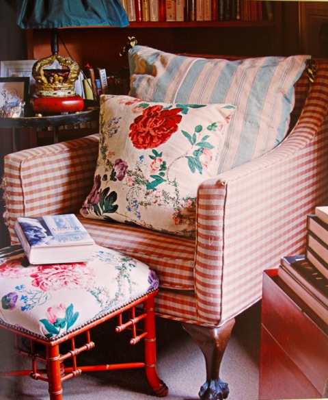
Geo’s taking inspirations from a main botanical/floral/colourful print always works, layering their scales and intersecting the ‘star print’s’ colourscheme. A pattern beginner’s ‘painting by numbers’ if you like! Applied to cushions and lampshades it’s the quick fix/beginner’s luck mix of pattern play.
 In expert hands (read eyes) this acquires a sophisticated freshness, Salvensen Graham ticking this box above and Studio Duggan rocking it below.
 Penny Morrison’s scheme takes this one step further by beginning with her own design ‘Arabella’ curtains, a rippling pelmet perfectly complementing the rippling florals. Cushions and lampshades in simple, bold patterns play against the brilliance of the central cushion’s deep raspberry colour which perfectly complements the ‘arsenic’ green walls, while the soft tealy blues in the lampshade (note the matching fuchsia trim) pull all this together.

The plain sofa is both palette cleanser and inviting, take a seat, then …. look how she has evolved this room by a few years later, and choose another seat:
 I could keep going all day, happily analysing these pattern-rich interiors and what makes them work. In these spaces there’s an alchemy, a gold dust that occurs when interiors simultaneously invigorate and soothe the soul, that enriches daily life – surely the goal of all interiors?
So set forth with the beginner’s rules, extend your creative vision and reach for pattern rich alchemy.
Credits:
All designers and interiors quoted can be found on my pinterest.
